

Poster and social graphic
Date, venue, call to action
State the exact replacement including punctuation, protect sponsor marks and hierarchy, and check the result at both print and thumbnail size before approving it.
Upload a poster, sign, label, screenshot, or photo. Replace one exact text region while preserving the original layout, subject, lighting, surface, and all untouched copy.
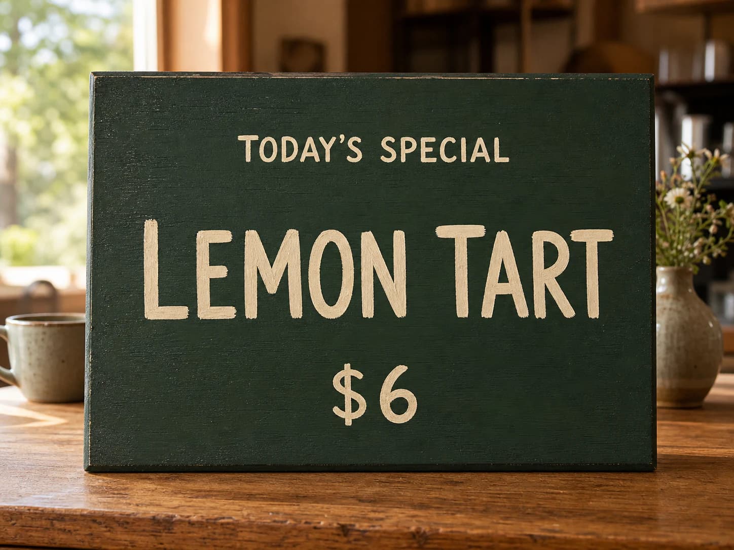
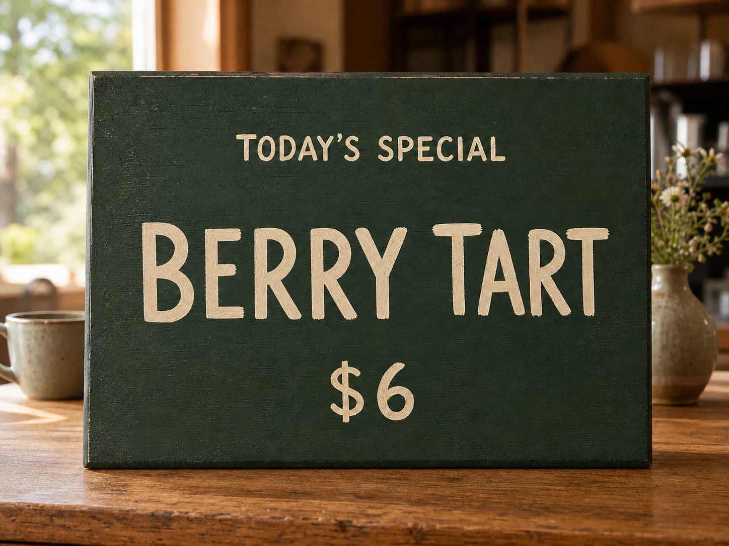
Exact replacement · same design
Compare illustration, border, type weight, alignment, color, and crop—not only the new words.

“LEMON TART” becomes “BERRY TART”; price, sign, counter, light, and props stay locked.
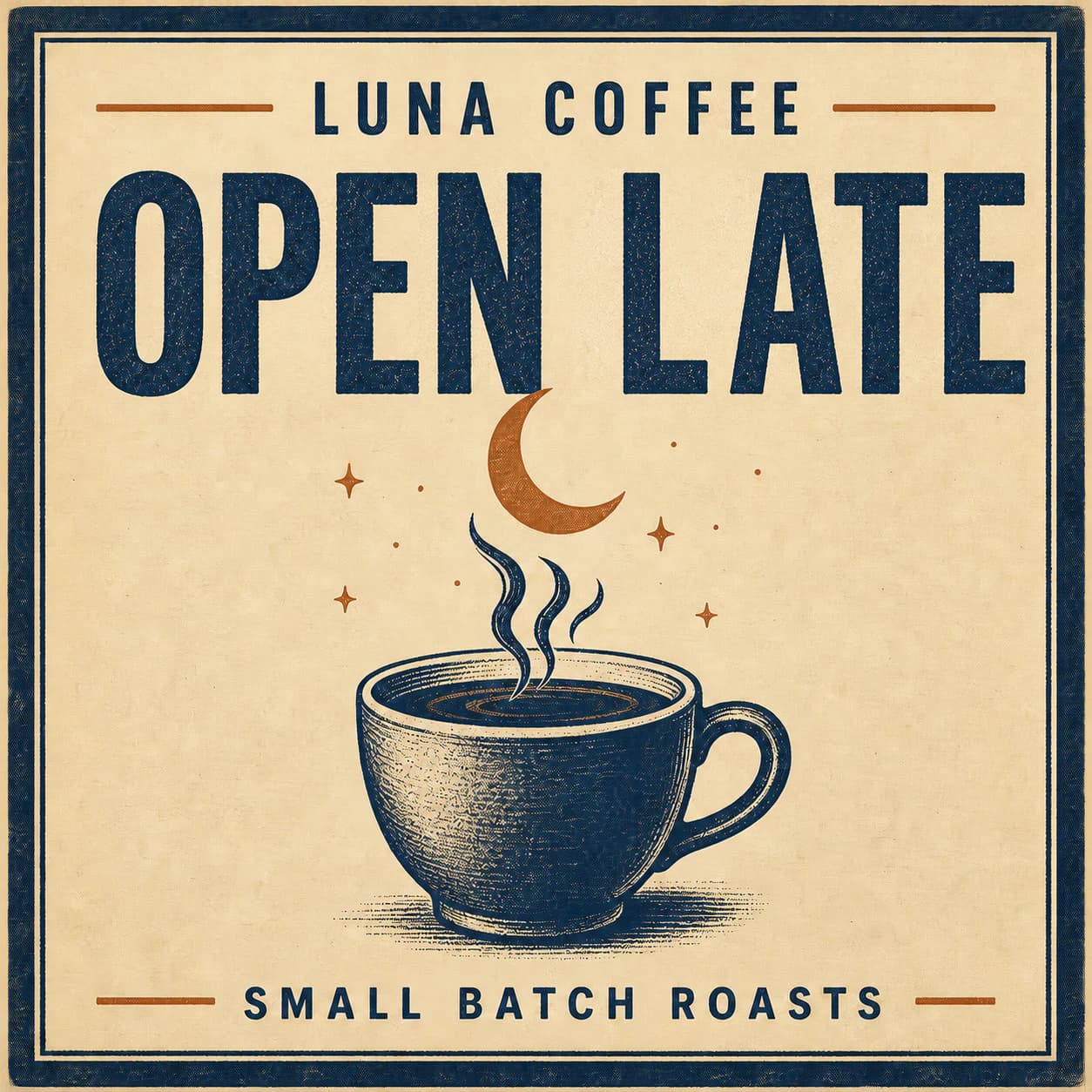
Replace only “OPEN DAILY” with “OPEN LATE”. Match the existing condensed serif lettering, size, color, spacing, and alignment. Preserve the café name, cup illustration, moon, border, texture, crop, and every other pixel.
Read every character, price, date, and unit at 100% zoom
Compare untouched words and design edges with the source
Reject any edit that redraws the subject or changes the crop
Interface walkthrough
The image-to-image tutorial shows the practical path from upload to prompt, model choice, generation, and result review. For text replacement, begin the prompt with the exact old and new strings, then describe the target region and the full preservation boundary.
Before and after · two real edits
Slide between the source and the result. The sign, menu, lighting, shadows, and every untouched line should survive the replacement.
Quote current and replacement wording, identify the sign by position, and preserve perspective, wear, hardware, shadows, and every other letter. Never rely on it for real wayfinding.
Treat each field as separate and exact. Lock the remaining menu, geometry, barcode, and ingredients. Prices, allergens, and regulatory copy still need human proofing.
Same discipline: exact old string, exact new string, and a preservation list.
Date, venue, call to action
State the exact replacement including punctuation, protect sponsor marks and hierarchy, and check the result at both print and thumbnail size before approving it.
Interface and title copy
Preserve icons, spacing, dividers, and status bars. Use the output for a mockup — update the real interface from its code and translation files, never from the image.
Proof every character, number, accent, and punctuation mark at full size. Image text can look plausible while still being wrong.
Compare weight, width, case, spacing, baseline, perspective, and surface texture—not only whether the replacement is readable.
Scan people, products, logos, prices, crop, light, and untouched copy. A successful local edit should not redesign the scene.
Move regulated copy into a source layout, obtain human approval, and keep the prompt, source, output, and review decision together.
AI text editor in image FAQ
The tool is strongest as a controlled visual edit. Exact commercial, legal, scientific, or operational copy still needs a human-owned layout and approval process.
Upload the original image, state the exact text that is visible now, state the exact replacement, identify where it appears in the frame, and list everything that must stay unchanged — people, products, logos, other copy, lighting, and camera angle. Generate one controlled pass, then proofread the output at full resolution. The most common mistake is skipping the preservation list: without one, the model treats the entire image as fair game and may subtly shift colours, reposition a shadow, or soften a nearby logo. Writing the list before you generate takes thirty seconds and saves a round of rework almost every time.
It can often reconstruct a similar type style, weight, colour, perspective, and surface treatment, but it does not extract or guarantee the original font file. Name every visible font trait you need preserved — serif or sans-serif, bold or light, condensed or wide, uppercase or mixed case — and review letterforms, spacing, kerning, and baseline alignment rather than assuming a perfect match. Small deviations that are invisible at social-media size become obvious on print or large-format output. If exact typographic fidelity is required for a brand or legal asset, finish the replacement in a vector layout editor and composite it back into the photograph.
Posters, signs, labels, menus, packaging, and social graphics with large legible text and a clean surrounding background are the best starting points. The model has the easiest time when the target text sits on a uniform or gently textured surface with strong contrast. Tiny copy, glare, folds, low resolution, ornate calligraphy, and text that crosses a face or complex texture need more review passes and are more likely to produce artefacts in the surrounding region. If the source image is marginal, crop closer to the target text, increase contrast, and remove distracting elements before uploading rather than hoping the model will handle everything at once.
That is the goal of a preservation list. Tell the model to change only the named text region and explicitly preserve people, product geometry, logo placement, colours, lighting, texture, camera angle, crop, and all other copy. Generative edits can still drift — a replaced headline may subtly shift the colour balance of the row above it, or a changed price may nudge the alignment of a neighbouring column. Compare the full output against the source image, not only the target region. Side-by-side inspection at full resolution catches the small drifts that look fine in a thumbnail preview and become obvious once the image ships.
Yes. Enter the original phrase and the translated replacement as exact quoted copy in the prompt. A translation can expand or contract significantly — Chinese to English often doubles the character count, while English to Japanese may halve it — so also specify whether the text should fit the existing bounding box, wrap to a second line, or use a slightly smaller point size. If the target language uses a different script direction, state that explicitly and check whether the surrounding layout elements need to mirror. The model handles multilingual replacement well when you give it clear spatial instructions alongside the linguistic ones.
Image generation is probabilistic, and text rendering is one of its hardest tasks, especially with long strings, small point sizes, curved baselines, stylised lettering, or low-contrast backgrounds. Keep each edit narrow — replace one phrase at a time rather than rewriting an entire sign in one pass. Quote the exact replacement in the prompt and request no additional or decorative text. Rerun if any character is wrong; do not try to fix a single misspelled letter with a second generation, because the second pass may introduce new drift elsewhere. When exact copy is mandatory — legal disclaimers, drug dosages, financial figures — finish critical typography in a layout editor.
Use it only for a visual draft, never as the source of record. Prices, ingredients, warnings, medical information, nutritional labels, financial claims, dates, URLs, and legal lines must originate from a source-of-truth layout file with version control and an explicit human approval step. Generated pixels are a convenience for visualising what the final sign or label will look like, not a replacement for the verified document. If someone downstream treats the generated image as authoritative — prints it, posts it, ships it on packaging — every character in the replacement text becomes your responsibility, and the model offers no guarantee of accuracy.
The page opens GPT Image 2 by default because it supports image-to-image editing and handles text-rich visual work more reliably than pure generation models. The visible model selector remains available in the generator interface, so you can compare another compatible image-editing model on the same replacement brief without re-uploading. Model capabilities and pricing evolve, so the selector always reflects what is currently available. If you switch models, keep the same prompt and preservation list to make the comparison fair — changing both the model and the instructions at the same time makes it impossible to tell which variable produced the difference.
Place the source and result side by side at full resolution and inspect the target region first: check spelling, punctuation, letter spacing, baseline, perspective, surface texture, and shadow consistency. Then scan every untouched region for drift — shifted colours, softened edges, moved logos, altered faces, or changed product geometry. At final delivery size, confirm the replacement still has the intended hierarchy and remains readable against its background. If the image is destined for print, zoom to 100 percent and walk the entire frame; artefacts that vanish at screen size can be painfully obvious on paper. Keep the source file archived so you can always re-compare later.
Optional cookies help us understand usage and measure ads. Essential cookies stay on so Voor works.