
Icon
1,024 positions
Image → palette → placement plan
A real lighthouse source is already loaded. Tune its width, palette, dithering, and grid—or replace it with your own image.
Need an original sprite or scene instead of a deterministic conversion? Start with the AI Pixel Art Generator, then bring the result back here for palette planning.
Local browser converter
Your source stays in this browser tab. Conversion uses the documented Wplace palette and exports a true low-resolution PNG.
Double the width and height, and the position count becomes four times larger.
Icon
1,024 positions
Mascot
2,304 positions
Team piece
4,096 positions
Scene
9,216 positions
If the subject fails at thumbnail size, extra detail will not rescue it.
Keep large connected shapes before preserving small highlights.
Use the grid to place the approved plan, not to judge the composition.
One lighthouse · three budgets
Read the strip from left to right: silhouette first, internal color regions second, small accents last. The 96-pixel version is not automatically the best team plan.
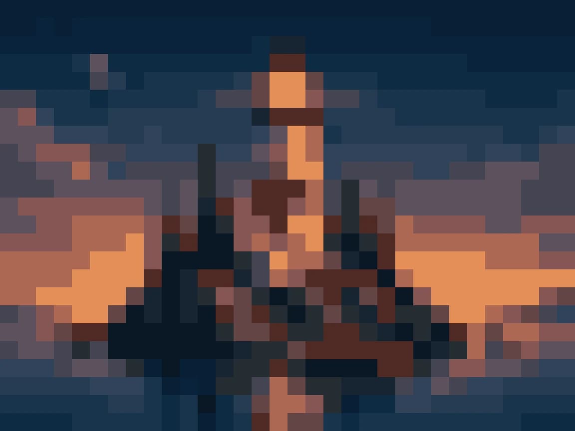
1,024 positions at a square target; broad forms dominate and small windows disappear.
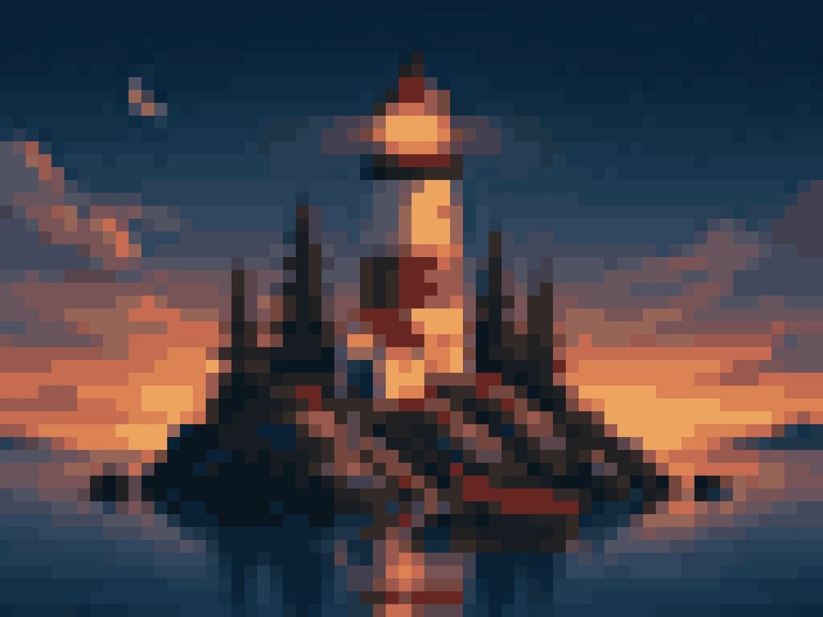
4,096 square positions; the tower, island, glow, water, and sunset all remain distinct.
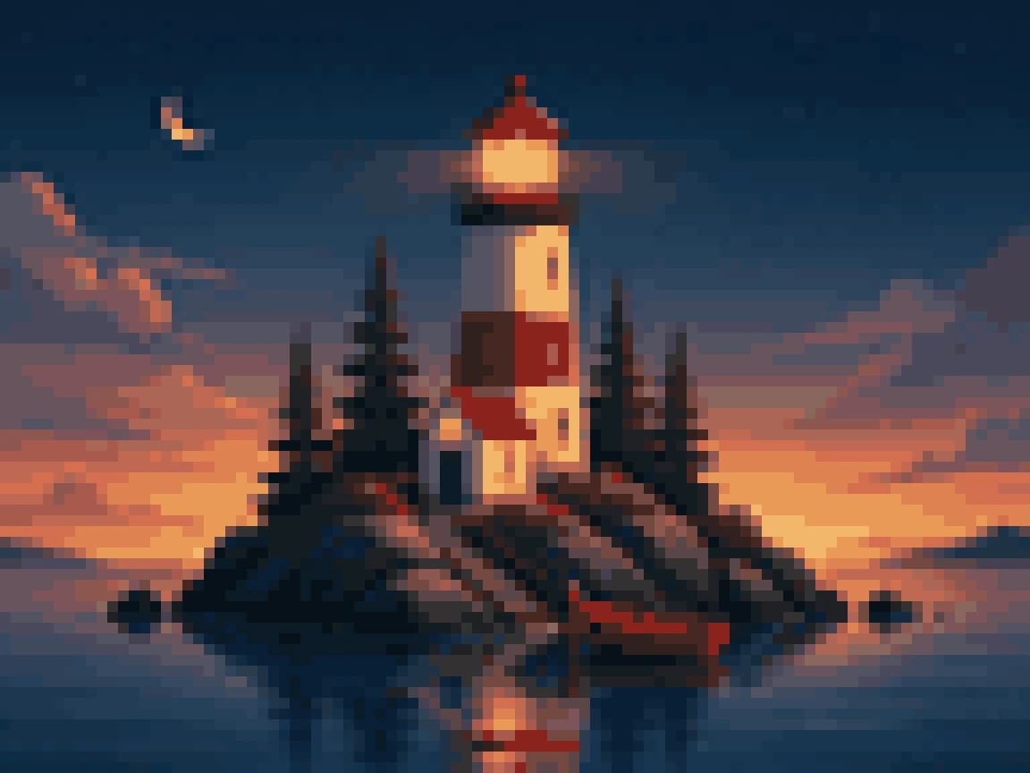
9,216 square positions; extra coast, reflection, and structure become possible but require more coordination.
Automatic conversion proposes a plan. The final Wplace pixel art still benefits from crop, silhouette, and manual cluster decisions.

Crop to the head and one identifying prop. Preserve silhouette, eye spacing, and two or three signature colours. Simplify hands and features into clusters, not isolated pixels.

Start from a flat-colour vector source, convert without dithering, then rebuild critical diagonals by hand. Prioritise border shape, one symbol, and a limited palette.

Anchor on one skyline or bridge and split sky, subject, and foreground into large regions. Drop most typography — palette and silhouette carry the reference.
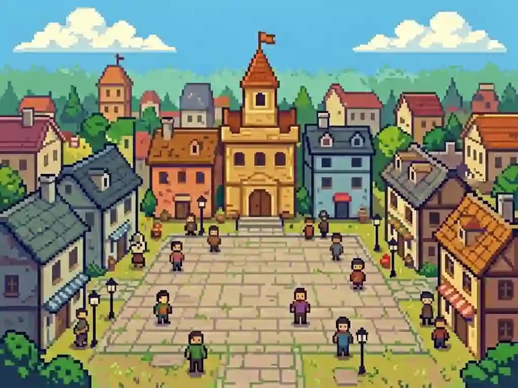
Design around large connected regions that teams can be assigned. Detail only near focal points. The best plan is the one people can coordinate accurately, not the busiest.
Name the allowed colors and test the free palette first. Add premium colors only for a visible need, not because more options exist.
Place corners, silhouette turns, eyes, signs, and other landmarks before filling large fields. Anchors prevent region drift.
Give contributors coordinates, boundaries, colors, and a shared version. Resolve boundary edits before two teams build incompatible edges.
Keep a clean native PNG as the master and a separate enlarged grid preview for coordination. Do not distribute several competing masters.
Wplace pixel art FAQ
The converter creates a useful visual plan. Wplace rules, placement access, contributor coordination, and the final manual cleanup remain separate decisions.
No. The current converter reads the selected file into a canvas element inside this browser tab, performs resizing and palette matching locally using JavaScript, and prepares the PNG download entirely on your machine. Nothing is sent to a server during conversion. The exported plan file is still your responsibility to store, share, and place according to the current platform rules and your team's coordination process. That also means conversion speed depends on your own device — a large source image on older hardware may take a moment, but it will never queue behind other users.
Start with 32 or 48 pixels for icons and simple mascots, 64 pixels for a recognisable team piece with internal detail, and 96 pixels only when the subject genuinely needs more structure — a detailed building, a multi-character scene, or a design with readable internal lettering. Width and height multiply, so a modest increase creates thousands of additional positions to coordinate. A 64-pixel square target is 4,096 positions; a 96-pixel square is 9,216. The extra detail is only worth the extra coordination when the subject actually uses it — many designs look better at a smaller size because the constraint forces bolder shapes.
Enable dithering for skies, water, smoke, soft light, skin tones, and gradients that otherwise collapse into hard colour bands at low resolution. Turn it off for logos, lettering, emblems, flat characters, geometric borders, and anything where clean edges matter more than smooth transitions. Dithering scatters intermediate-colour pixels across adjacent cells to simulate a gradient, which is great for atmosphere but destructive for legibility. Compare the silhouette and large colour regions with and without dithering before accepting the result, and remember that scattered pixels are harder for a team to place accurately than solid-colour blocks.
It expands the palette available to the conversion beyond the standard free set, which can preserve subtle colour relationships in skin tones, natural landscapes, and graduated materials. However, more colours also increase team coordination overhead and may weaken a bold limited-palette design that reads better with strong contrast. Build a free-palette version first, compare it side by side, and enable premium colours only when a specific material, skin tone, or gradient clearly improves in a way that matters to the final placement. The premium toggle is a quality dial, not an upgrade button — more colours are not always better.
It is a low-resolution planning PNG, not an automated placement action. The converter gives you a map; the placement is still manual work done on the live platform. Confirm current Wplace rules, available coordinates, palette access, template tools, timing windows, and team permissions separately before starting. Use the grid overlay and pixel counts to divide the work into assignable regions, and keep a shared approved master file so all contributors are following the same version. If the platform rules change between planning and placement — new palette restrictions, coordinate conflicts — update the master before anyone starts building.
Photography contains continuous-tone texture, subtle lighting gradients, and small edges that all compete for attention at low pixel resolution. The converter cannot decide which detail matters, so it tries to preserve everything and the result looks noisy. Crop closer to the subject, simplify or remove the background, raise contrast between the subject and its environment, and lower the output width until the silhouette becomes the dominant visual feature. Manual cleanup after conversion is normal and almost always improves the placement plan — the converter gets you eighty percent of the way, and the last twenty percent is editorial judgement about what to keep and what to simplify.
Use very short copy — three or four characters maximum — with a purpose-built pixel font, strong foreground-background contrast, and enough output width that each letter has at least five or six pixel columns to work with. Do not expect a photographic sign or printed label to survive automatic reduction; the converter treats text the same as any other image detail and will blend letterforms into the surrounding colour. Rebuild critical letters manually on the pixel grid, check them at one-hundred-percent zoom, and keep decorative texture or dithering away from the glyph shapes so the characters remain distinct.
Divide the approved master into named rectangular regions with clear pixel-coordinate boundaries and a single owner per region. Place silhouette anchors, high-contrast landmarks, and border lines first so the overall shape is visible and teams can see whether their region is drifting. Then fill large solid-colour fields, then details and shading. Share one palette legend, one version number, and one communication channel for corrections. Record any approved change to the master before contributors continue from what may already be an outdated version. Boundary conflicts between adjacent regions are the most common coordination failure — resolve those before anyone starts filling interior detail.
Inspect the silhouette at thumbnail size to confirm it reads at a glance. Verify the colour count matches what your team actually has access to on the platform. Compare dithered and clean versions side by side if you toggled dithering. Zoom into eyes, lettering, and any small identifying feature to make sure they survived the conversion. Confirm the crop contains no accidental transparent edge or stray pixel row at the border. Export the no-grid version as the master file for placement, then keep a separate enlarged grid-overlay version for coordination — the grid preview is a communication tool, not the file your team should be placing from.
Optional cookies help us understand usage and measure ads. Essential cookies stay on so Voor works.