Example Image
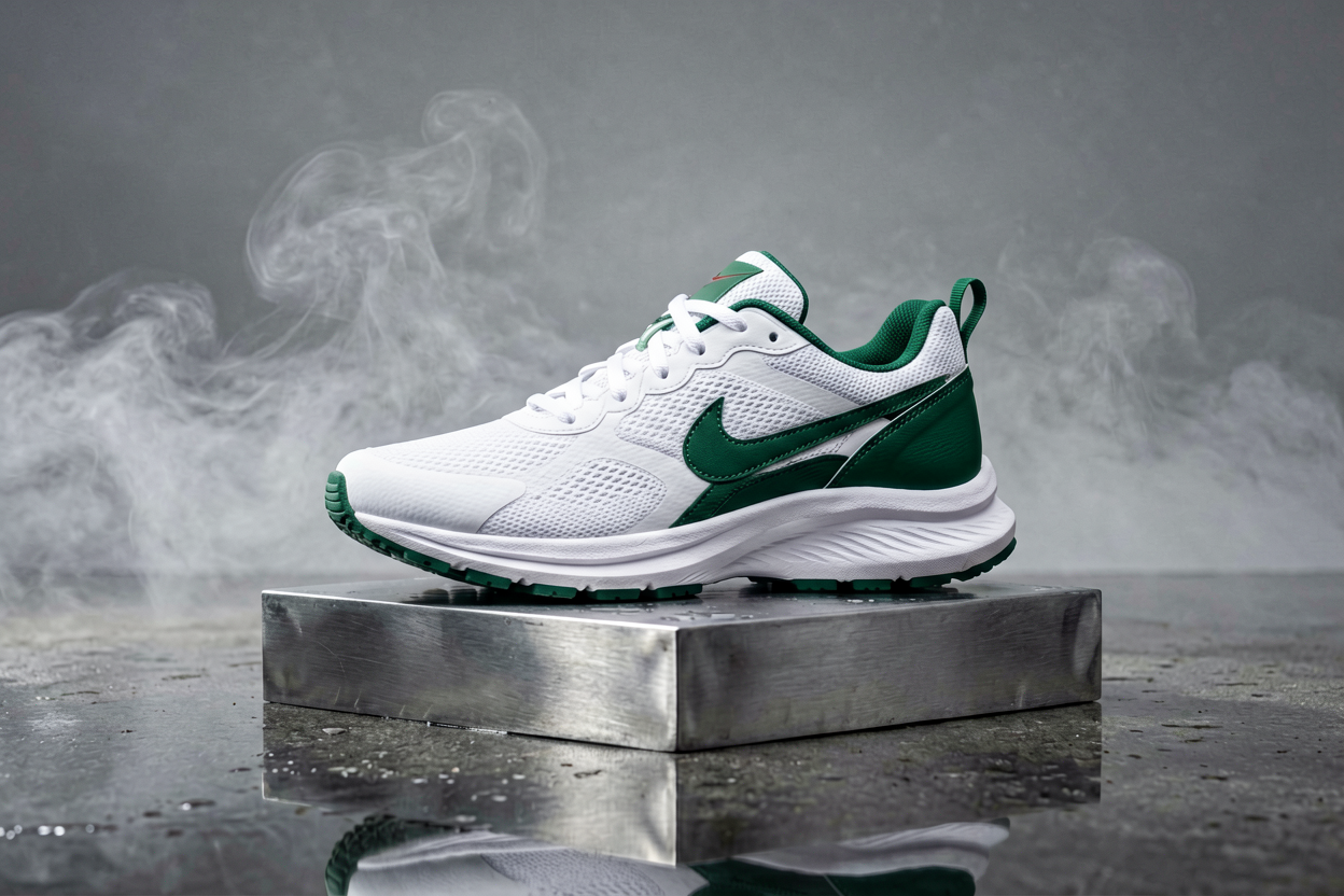

Turn briefs, storyboards, and campaign copy into on-brand stills without wrestling with node graphs. Voor AI routes your prompt through curated image models so you can iterate on composition, palette, and subject fidelity in one place.
Use this page for campaign concepts, product scenes, posters, game references, thumbnails, profile visuals, and any first-pass still where no source image exists yet.
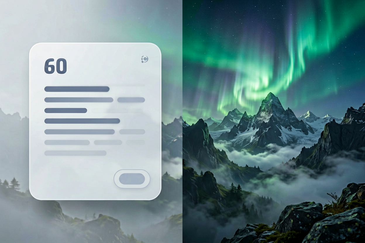
Text-to-image cover
Start from prompt, then refine the strongest direction.

GPT Image-2 sample
Readable layout and text-heavy image work can start here.
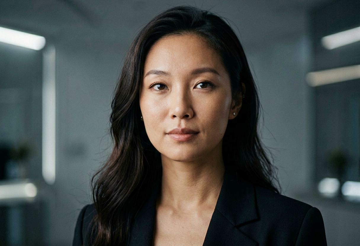
Product and ad concepts
Use concrete material, camera, lighting, and crop details.
Hero image
Premium SaaS dashboard on a glass desk, warm side light, empty left third for headline, realistic reflections, 16:9.
Product shot
Matte ceramic skincare bottle, soft shadow, cream background, readable simple label area, ecommerce crop, no extra props.
Character concept
Stylized explorer character, readable silhouette, teal jacket, compact backpack, clean turnaround reference, neutral background.
Stock can be fast, but it rarely nails your exact lens, wardrobe, or layout. Text to image AI shines when you need dozens of coherent variants for paid social, landing hero tests, or pitch decks where art direction must stay consistent.
The workflow is simple: write a structured prompt (subject, environment, lighting, camera), generate, then refine with negative prompts or reference images on supporting tools like image to image when you need tighter control.
Separate camera grammar from subject description. Phrases like “50mm, shallow depth of field, soft key light” give models a stable 3D cue, while mood words belong in a second sentence so you can tune emotion without breaking geometry.
Name materials and textures explicitly—brushed aluminum, matte paper, worn denim—instead of vague “high quality” adjectives. Models allocate detail budget more efficiently when constraints are concrete.
You pick the model family that fits latency and fidelity, then stay inside the same collection for related shots so color science does not drift between frames. Featured outputs on this page show what finished generations look like in production ratios.
For brand work, pair generated stills with your legal review checklist: logos, recognizable people, and third-party marks still need clearance even when the pixels are synthetic.
A useful text to image AI workflow starts with the business use, not the model name. A landing-page hero needs a clean focal point and room for copy. A product ad needs material accuracy, believable shadows, and a crop that works in feed placements. A game concept needs readable silhouettes and repeatable style notes. When the prompt names the channel, the image is easier to judge and easier to improve.
Voor AI keeps text to image AI close to the rest of the creative stack. You can generate a still, move the strongest result into image to image AI for tighter edits, upscale the approved asset, or animate the frame with image to video. That connected workflow matters because production rarely ends with the first generated image.
For teams, text to image AI should leave a trail: prompt, model, ratio, selected output, rejected output, and final use case. That record helps marketers compare creative tests, helps designers reproduce a style, and helps founders avoid starting from scratch every time a campaign needs one more variant.
Inspect hands, faces, product labels, logos, small type, jewelry, repeated patterns, and hard edges. Text to image AI can make a strong first impression while hiding small failures that matter in paid ads, ecommerce, thumbnails, and pitch decks.
Keep prompts specific but not overloaded. A strong text to image AI prompt names subject, environment, lighting, camera, style, aspect ratio, and constraints. A weak prompt asks for every creative idea at once and gives the model no hierarchy. If the composition is right but the detail is wrong, continue with image to image AI instead of regenerating the entire concept.
Use related tools when the job changes. Background removal, restoration, super resolution, image to video, and app presets are not separate islands; they are the next steps after a text to image AI draft becomes useful enough to refine.
Approval usually depends on more than beauty. A usable still needs the correct crop, enough negative space, believable lighting, and a subject that reads at thumbnail size. For ecommerce, the product must remain recognizable. For editorial images, the composition must support the headline. For game art, the silhouette must survive small UI placements. Those requirements should appear in the prompt before the first run, not only after several failed attempts.
A practical production pass starts with broad exploration, then narrows. Generate several directions, choose one visual language, and only then refine details such as palette, material, props, and final aspect ratio. This keeps early work fast while preventing the final asset from becoming a random remix of every idea in the brief. The same principle applies whether the output is a hero image, social post, sticker, icon, character reference, or presentation visual.
Use naming and storage discipline. Save the selected prompt, model, ratio, and reason for approval. If a teammate asks for a similar image next week, that record is more useful than a screenshot in chat. It also makes A/B testing cleaner because each creative variant can be traced back to a specific change in subject, camera, background, or offer.
When a generated still is close but not finished, choose the next tool by the visible problem. A rough background needs cleanup, not a full restart. A soft result needs upscaling. A correct character with the wrong outfit needs controlled editing. A finished still that needs motion should move to a video workflow. The catalog below is intentionally broad so those next actions stay in view.
For SEO and AI search, plain-language task names matter. People do not only search for model brands; they search for product images, poster concepts, thumbnails, game assets, ad visuals, profile pictures, restoration, and background cleanup. This page gives those tasks enough context for users and search systems to understand where the generator fits in the larger Voor AI workspace.
The first render is usually a direction, not the finish line. If the result has the right composition but weak detail, keep the prompt and change the model or quality setting. If the result has the wrong subject, rewrite the opening sentence. If the result has the right subject but poor cleanup, use a specialist page rather than forcing the same generator to solve every problem.
Text to image AI is most efficient when the user knows what success looks like. Before generating, decide whether the asset must persuade, decorate, explain, sell, or guide another tool. A persuasive ad image needs a clear offer and focal point. A decorative background can be more abstract. A reference image for motion should have clean depth cues and stable edges.
For teams running weekly creative tests, build prompt templates. Keep slots for audience, offer, product, scene, style, ratio, and constraints. A template lets one person change the product while another changes the setting, without losing the structure that made the last batch work. This is how text to image AI becomes a repeatable production habit instead of a one-off experiment.
When the output includes people, products, or brands, add a review step before export. Look for accidental likeness, misleading claims, fake UI, broken packaging text, and marks that resemble real companies. The generator can accelerate creative work, but approval standards still come from the campaign, client, or marketplace where the image will appear.
The related tools rail is meant to support this decision tree. Open image editing when the asset needs localized changes, background tools when the scene is cluttered, video tools when the still should move, music tools when a clip needs sound, and app presets when a repeatable style is faster than rebuilding a prompt from scratch.
A still image becomes more valuable when it can support several downstream uses. Leave space for headlines when the asset may become a landing hero. Keep the subject centered when it may become a square thumbnail. Use clean depth cues when it may become a video source. These decisions are easier to make before generation than after a crop has already failed.
When comparing outputs, choose the version with the strongest structure, not only the most detail. A clean composition can be edited, upscaled, animated, and adapted. A noisy but flashy result often breaks when another tool tries to use it.
Document the creative reason for approval. Was it the lighting, product angle, character expression, color palette, or background? That note helps the next tool preserve the right quality instead of accidentally changing the part that made the image work.