Weather
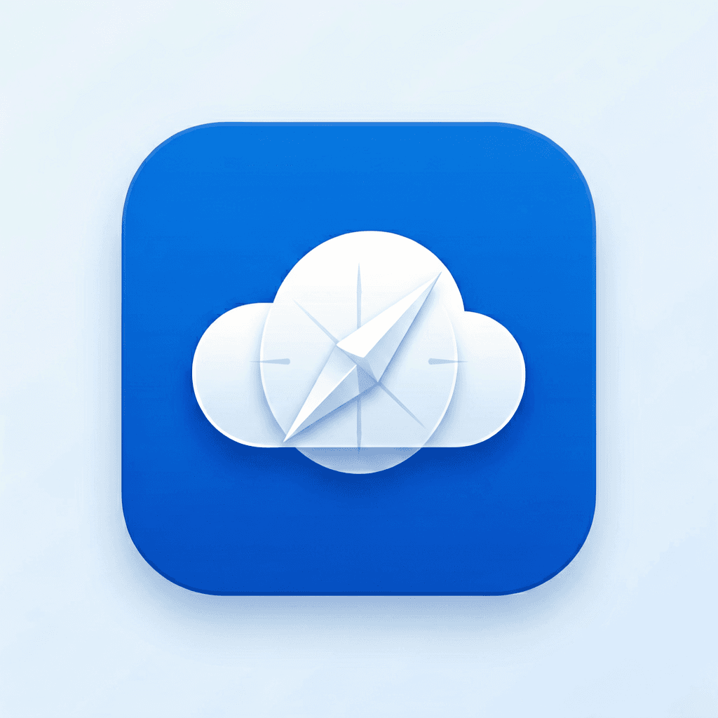
Turn a cloud into a compass, not a miniature landscape. Lock one palette, then compare silhouette clarity first.


Design brief, not decoration
An app icon generator has one unusually strict job: communicate a product in a square that may be smaller than a thumbnail. The the goal is not simply to make a pretty picture. A useful workflow must help a founder choose a symbol, establish a visual system, keep the subject inside platform safe areas, and produce a master that still reads after aggressive downscaling.
Voor connects this page to Recraft v3 because the model is oriented toward designed assets. Start with product function, audience, one metaphor, palette, material, and depth. Do not ask for an entire onboarding screen inside the icon. One focal silhouette beats six tiny ideas.
Turn a cloud into a compass, not a miniature landscape. Lock one palette, then compare silhouette clarity first.
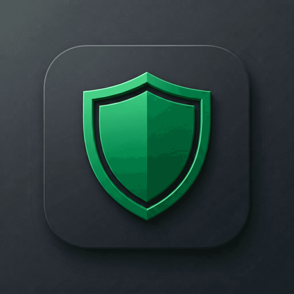
Use one shield or ledger metaphor; avoid dollar-sign clichés. Lock one palette, then compare silhouette clarity first.
Prefer a calm pulse, leaf, or protected heart over medical clutter. Lock one palette, then compare silhouette clarity first.
Reduce the lens to two rings and one memorable highlight. Lock one palette, then compare silhouette clarity first.
Build the silhouette around rhythm; keep the note readable at 32 px. Lock one palette, then compare silhouette clarity first.
Combine one route shape with one place cue, then simplify again. Lock one palette, then compare silhouette clarity first.
A checkmark needs a distinctive container or motion idea. Lock one palette, then compare silhouette clarity first.
A lock is generic until material, negative space, or geometry makes it yours. Lock one palette, then compare silhouette clarity first.
Ask for a clean 1:1 master without a baked device mask. Keep the symbol away from edges.
Preview the approved artwork under iOS squircle, Android circle, rounded square, and monochrome adaptive treatments.
Upload the approved 1024×1024 master to the exporter above, select iPhone, iPad, watchOS, macOS, or Android, and download one ZIP containing the required PNG sizes with consistent filenames.
The official Recraft examples in the history panel show the model’s real design range: flat marks, illustration, characters, product imagery, and logo-like forms. They are source evidence, not outputs generated by Voor. Use them to judge whether Recraft’s visual language fits the app icon generator brief before spending iterations. The package builder handles predictable raster sizing and naming after approval; native Xcode Contents.json and Android XML can then be added inside the platform project.
No. It creates concept artwork. Export the approved master into Apple, Android, Windows, and web sizes afterward.
Recraft is design-oriented and strong at flat, vector-like, and controlled icon families rather than cinematic illustration alone.
Yes, but lock palette, corner treatment, lighting, and line weight in every prompt. Treat consistency as a system.
Usually no. Home-screen icons are small; the label already appears below them and generated letters often reduce clarity.
Place it on a real phone screenshot beside competing apps at 29, 40, 60, and 1024 pixels.
The current Voor flow returns raster concepts. Rebuild or vectorize the approved mark when editable paths are required.
A single ownable metaphor, confident silhouette, restrained palette, and detail that survives downscaling.
They overlap, but an icon must work inside a platform mask and at tiny sizes; a wordmark has different constraints.
Review Recraft terms, verify originality, and clear trademarks before publishing.
Real output gallery
 Example 1
Rounded cobalt app icon, white cloud folded into a compass needle, soft depth, no text, centered, generous safe area
 Example 2
Emerald shield built from two clean ledger lines, premium dark background, restrained 3D depth, no letters